essie
First Double Page in magazine
Our mandate was to refine current visual DPS charter to increase the luxury feel in order to gain positioning in the luxury wall before the table of contents in magazines. We propose 4 different options that illustrate the evolution of the DPS, based on the luxury review as well as the brand guidelines, from standard to out-of-the-box. The current DPS & SP had no logo placement consistency, two different messages for copy and visual, the overall look was not unified.
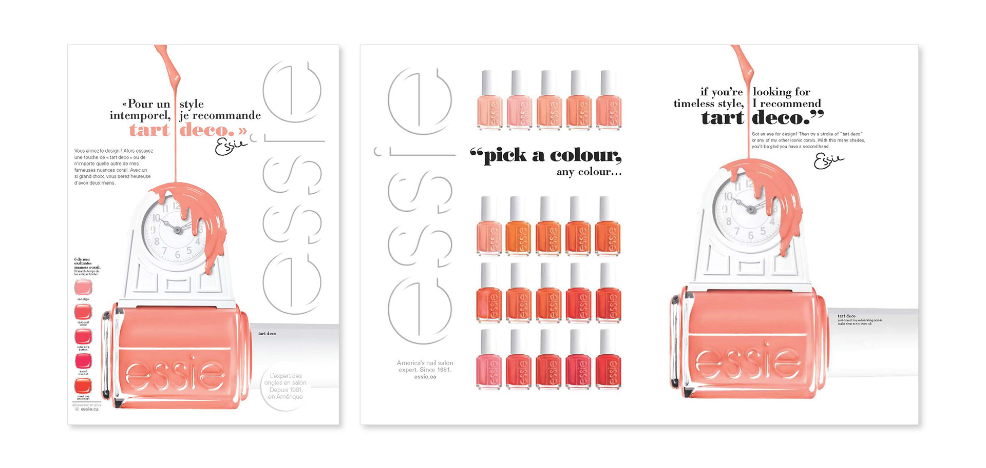
Option 1
Repositioning of existing elements.

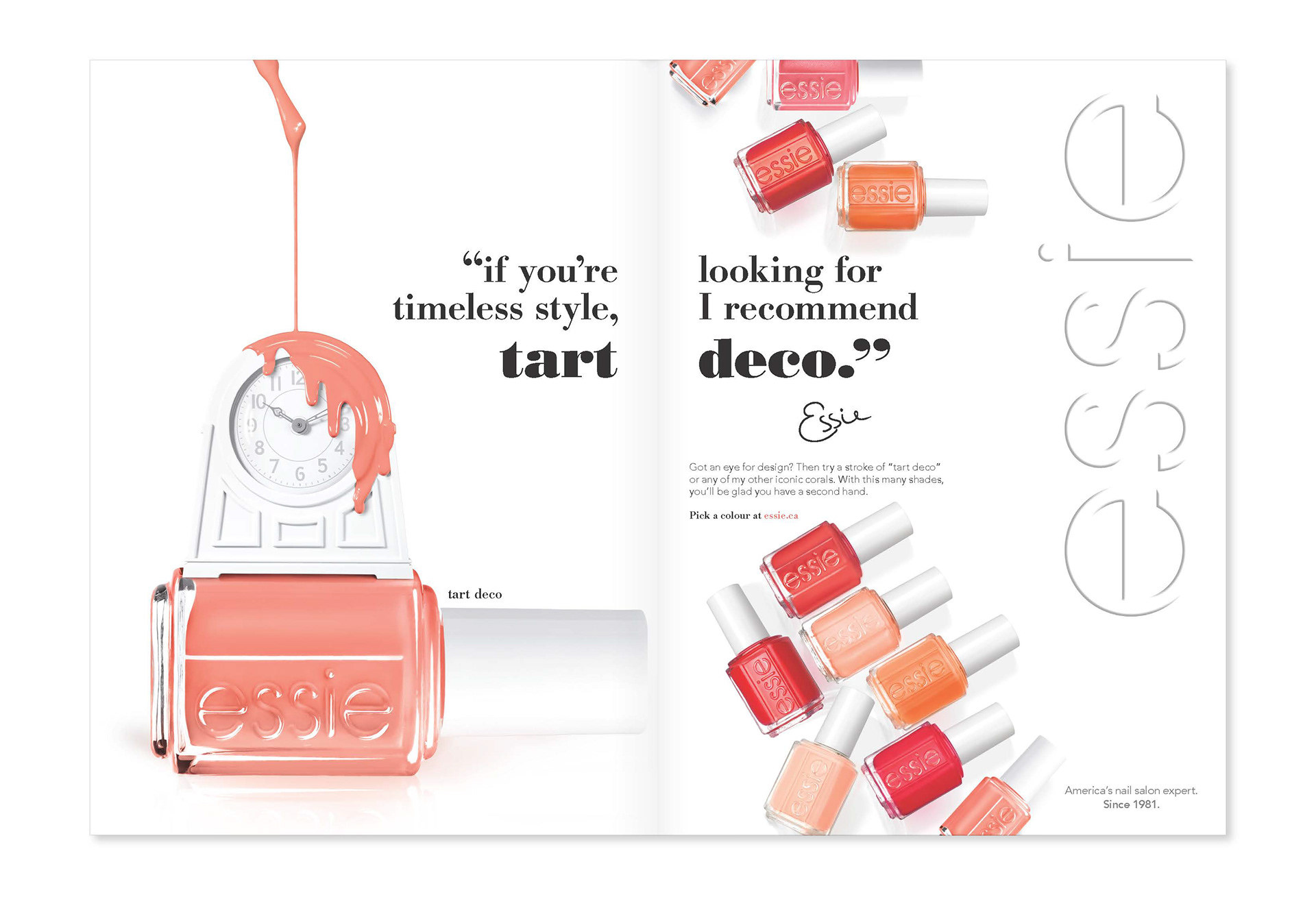
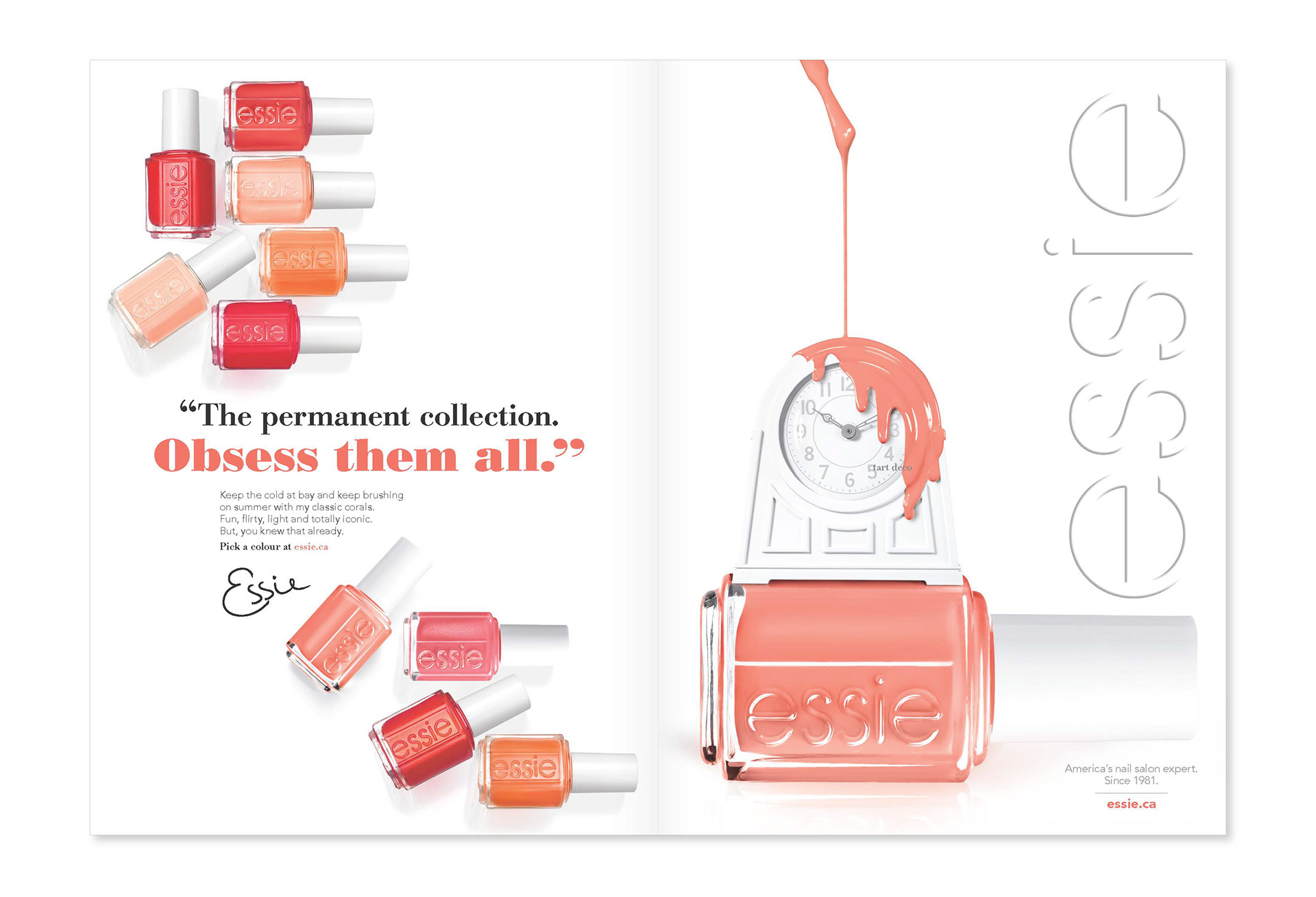
Option 2
Two visual messages, one copy message starifying the hero shade.
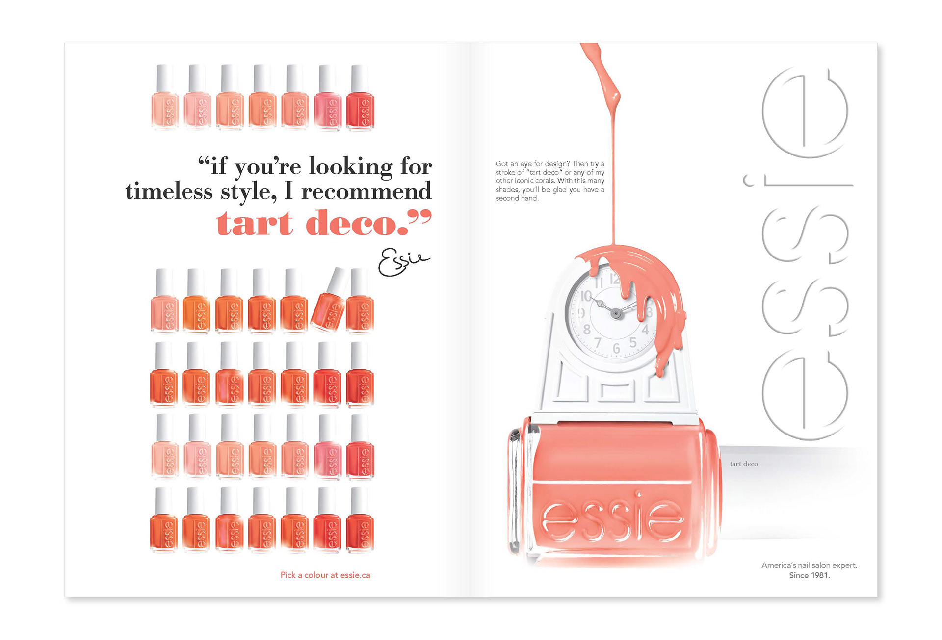
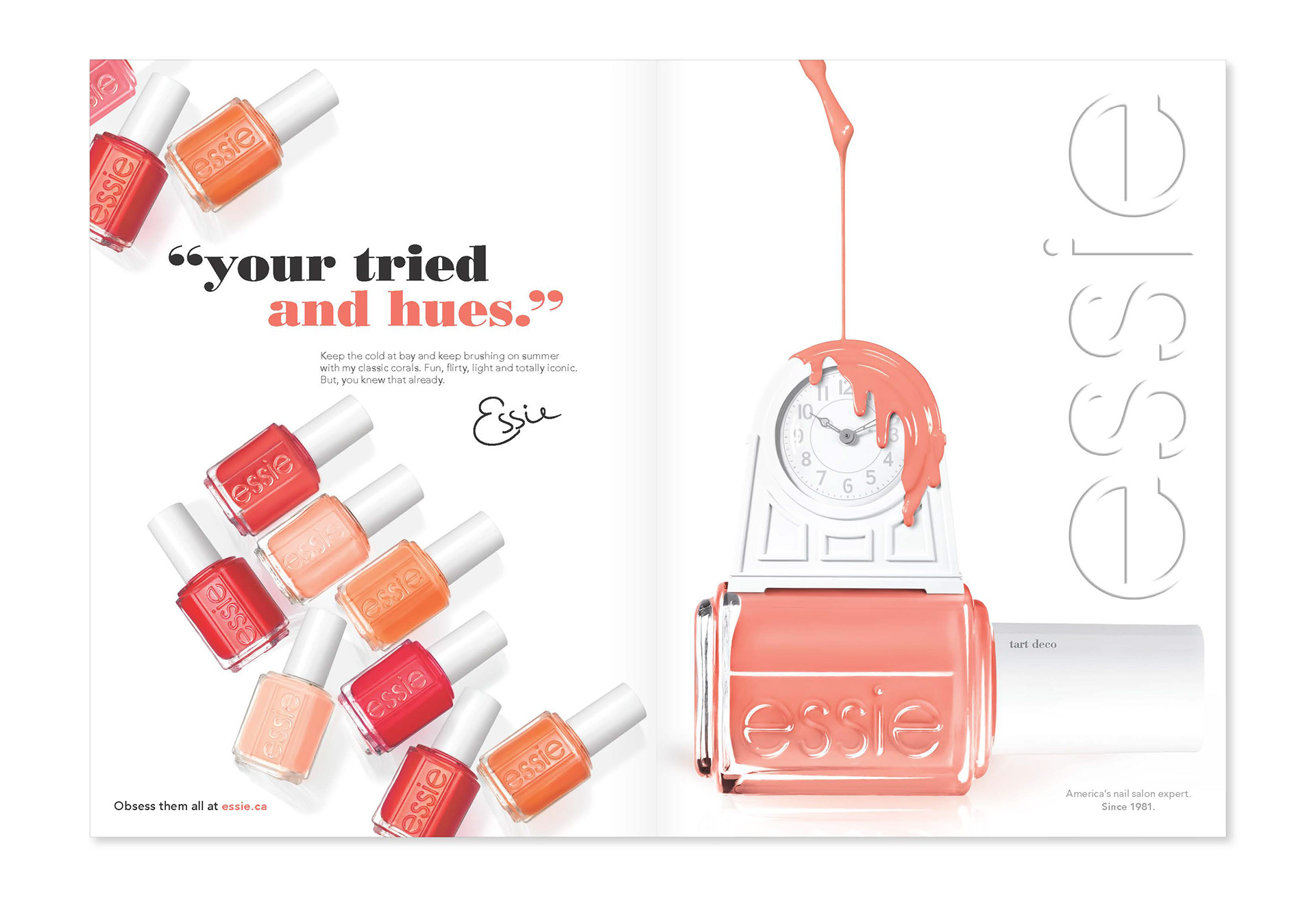
Option 3
One unifying copy message, 2 visual messages.
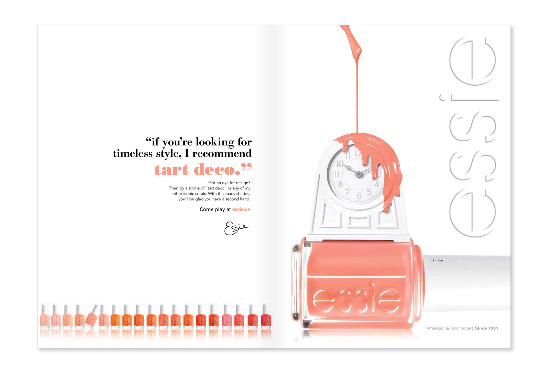
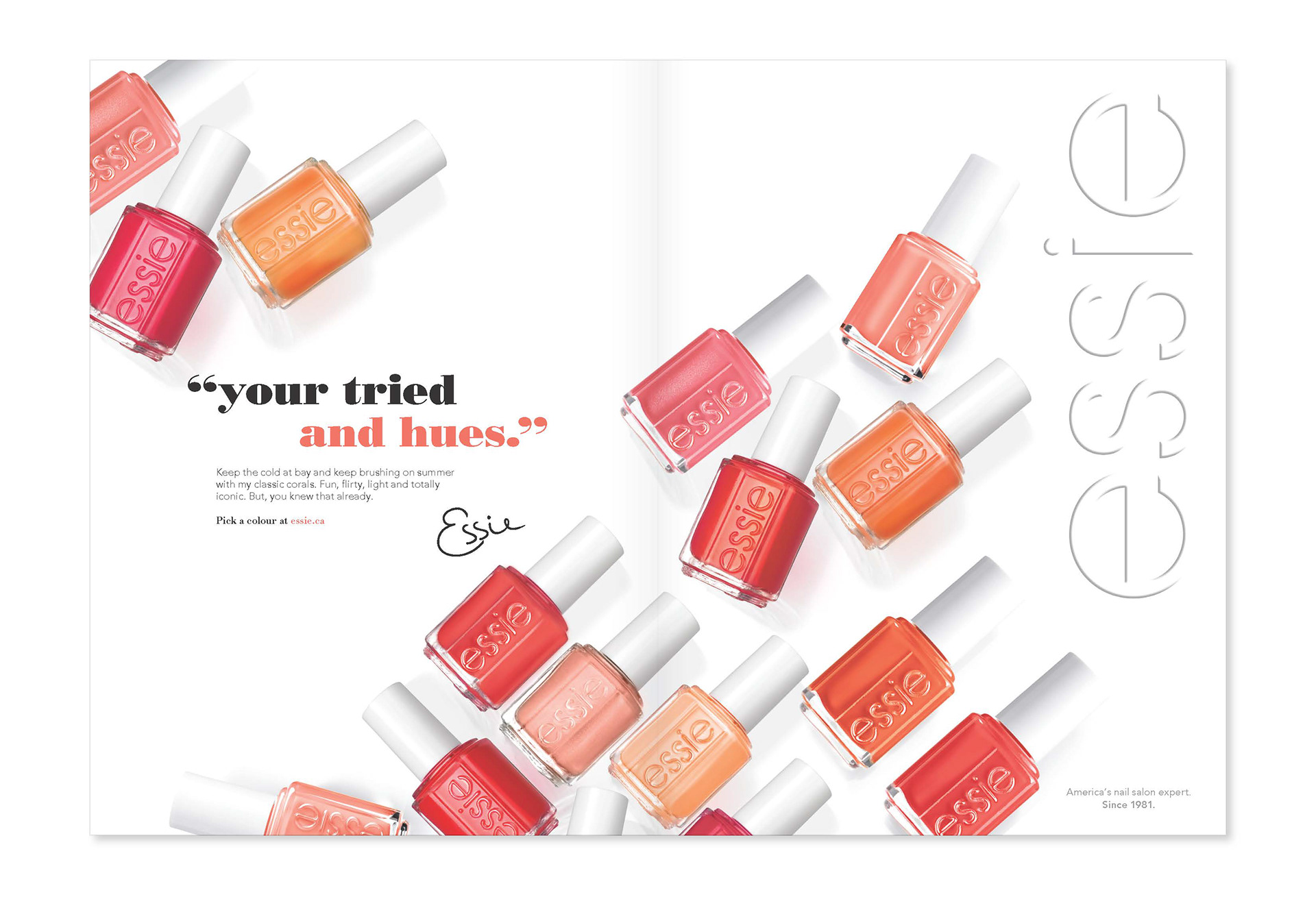
Option 4
One copy message, one integrated visual message.
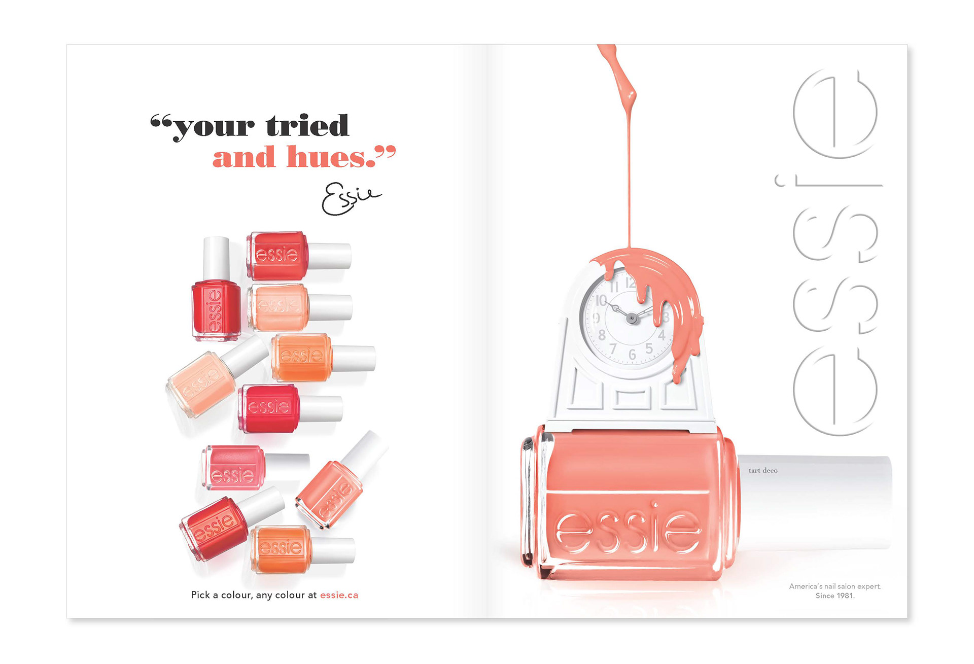
*Agency recommendation.
2015